 Recommendations to include essential elements in the website of your company and generate a more interesting browsing experience.
by Julián Arcila*
Presentation is what counts. Does this phrase ring a bell? Maybe you have heard it from a family member or friend before a love date or a job interview, for which we all try to see ourselves in the best way according to our goal in that meeting: to attract that possible partner or employer. In the case of web design for SMEs, there are a number of elements that you must take into account to generate a good first impression before any user who accesses your website, motivated by knowing your SME and to which you try to give your best face despite not being present at the time of the visit.
Why is web design important for an SME?
According to We Are Social's latest annual report in partnership with Hootsuite, there are currently 4.54 billion people with internet access, equivalent to 59% of the world's population. Of all that set of potential visitors, who is the web design of your SME aimed at?
This is a question that you should ask yourself when designing your website, because each user of the network has a specific interest to access it. That is why it is elementary that you profile your target audience; who your potential customer is and what their needs are.
By being clear about the type of user and their search expectations on your page, you must establish what you want to communicate. This starts from the selection of your domain name to the resources you will allocate in it. In this way you will be able to recognize what is the value proposition that your SME wants to visualize and from which you want to position yourself.
What elements should your SME's website design have?
From the clarity in the message, we can now concentrate on how we want to present it. The head of design of Pymes Go Digital, Brayan Muñoz, puts it this way: "Human beings are susceptible to first impressions. This generates criteria and allows us to make sound decisions. The same goes for the design of a website: it must be attractive to those who enter and navigate each of its pages. If not, the user will most likely abandon your website and look for the same solution elsewhere."
These are 3 principles for web design for SMEs:
• Visual hierarchy
• Smooth navigability
• Consistent typography
Visual hierarchy
The world is configured to see it in an organized way and thus distinguish some objects from others. In the same way, the web pages are built to be read from the order you choose to project your SME. By Western convention, our gaze tends to read from left to right and from top to bottom, so you already have an idea of how you should place the most important elements on your site so that they are processed in a clear and simple way.
In that sense, your SME's website should have a structure that determines your visual focus. Thus, the size you have to give greater or lesser importance to a certain element becomes relevant. This is a key feature to guide the attention of your users. Not all the elements can have the same size, otherwise the reading would be monotonous and you would not be able to highlight the value of each fragment.
The contrast of the elements plays a fundamental role. This is given from the selection of a palette of colors, among which white can undoubtedly be definitive. Yes, you read that right: the white space, where there are no texts or graphics, allows you to better contrast each element and attract attention according to what your SME wants to point out.
Now, the color scheme is key to highlighting one element over another. There you have to choose from strong colors to pastel colors that, according to how you distribute them, according to the visual line of your SME, can create the desired effect.
Likewise, another factor to consider is the grouping of elements of your SME by common properties to separate different sections within your site. This is closely related to the location, because as we mentioned, the elements arranged in the center and at the top will concentrate more attention than those located in the lateral or low stripes.
Smooth navigability
The way in which you organize the website of your SME, more from what your visitors are looking for than from the administrative structure of your SME, will allow an intuitive journey by each user. Your SME's website should have unobstructed navigation on both the home and secondary pages, where each party, including internal links, can be a useful tool to clearly explore all the resources of your business.
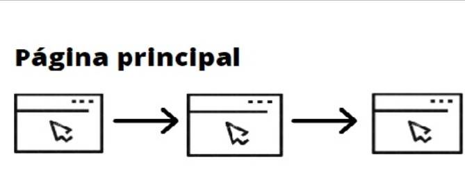
There are several paths according to the structure selected for web design for SMEs. One option is a straight line to guide the reader from the beginning to the end of the page, so the path should not be very long.
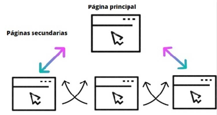
But if you want from the beginning to offer your visitor the link to secondary pages, and that these in turn are connected, you must opt for a tree structure.
Otherwise, it is worth considering the option of a model in which the secondary pages do not appear linked to each other, but only to the main page. In that case you should opt for a radial structure.
Consistent typography
Finally, the texts you build from the web design for SMEs must be friendly to the reader, both from the background and in the form of presentation of them. For this it is necessary that you incorporate the advice provided about the contrast with the color palette that you decide to use, because the good readingability of them depends on it.
Make sure, for example, that you don't use a light font color on a white background. Likewise, make sure that the size of this is not very small and that it appears in proportion to what you consider relevant to highlight. Along with this, keep in mind a standard model of no more than three sources that in this way give prominence to your SME.
* Julián Arcila, GENERAL MANAGER of Pymes Go Digital.